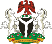
The Nigerian Coat of Arms
The Nigerian coat of arms is a black shield with a wavy white pall, representing the confluence of the Niger and Benue Rivers in Lokoja. The dark shield signifies the fertile land of Nigeria, while the two horses on either side signify dignity. The eagle symbolizes strength, while the green and white twists of the shield’s torso signify fertile soil.
The red flowers at the base are the national flower of Nigeria, Costus spectabilis commonly known as yellow trumpet. This flower was chosen for the Nigerian coat of arms since it is widespread throughout the country. It represents the beauty of the nation. In1978, the original motto, “Peace, Unity, Freedom” was changed to “Unity and Faith, Peace and Progress“.
The Nigerian National Anthem
Arise, O compatriots, Nigeria’s call obey
To serve our fatherland
With love and strength and faith
The labour of our heroes past
Shall never be in vain
To serve with heart and might
One nation bound in freedom, peace, and unity.
Oh God of creation, direct our noble cause
Guide our leader’s right
Help our youth the truth to know
In love and honesty to grow
And living just and true
Great lofty heights attain
To build a nation where peace and justice shall reign.
About the National Anthem
“Arise, O Compatriots” is Nigeria’s national anthem. It replaced the previous national anthem, “Nigeria, We Hail Thee,” which was adopted in 1978.
The lyrics are a compilation of five of the top entries from a national contest. The lyrics were gathered from five contestants: Ilechukwu Eme Etim Akpan, B. A. Ogunnaike Sotu, Omoigui, and Aderibigbe P.O. Benedict Elide Odiase of the Nigerian Police Band composed the tune.
Although it has two verses, just the first is typically sung. The second verse is sometimes chanted as “The National Prayer.”
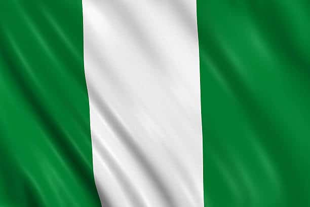
The National Flag
The flag of the Federal Republic of Nigeria was designed in 1959 and first officially hoisted on 1 October 1960. The flag has three vertical bands of green, white, and green. The two green stripes represent natural wealth, and the white represents peace and unity. It was designed by Michael Taiwo Akinkunmi.
The National Pledge
I pledge to Nigeria, my country
To be faithful, loyal, and honest,
To serve Nigeria with all my strength,
To defend her unity and uphold
Her honor and glory.
So, help me God.
Location:
- Western Africa, bordering the Gulf of Guinea, between Benin and Cameroon
Geographic coordinate:
- 10 00 N, 8 00 E
Area:
- Total: 923,768 sq km
- Land: 910,768 sq km
- Water: 13,000 sq km
- Land boundaries: 4,047 km
Border Countries:
- Benin 773 km
- Cameroon 1,690 km
- Chad 87 km
- Niger 1,497 km
Coastline:
- 853 Km
Highest Mountain:
- Chappal Waddi 2,419 m
Population
- 128,000,000 (2005 estimate) 8th most populous country in the world
Age Structure:
- 0-14 years: 42.3% (male 27,466,766/female 27,045,092)
- 15-64 years: 54.6% (male 35,770,593/female 34,559,414)
- 65 years and over: 3.1% (male 1,874,157/female 2,055,966) (2005 est.)
Population Growth Rate:
- 2.37% (2005 est) which will make Nigeria the fourth most populous country by the year 2050. May God help us!
Birth rate:
- 40.65 births/1,000 population (2005 est.)
Death rate:
- 17.18 deaths/1,000 population (2005 est.)
Life Expectancy at Birth:
- Total population: 46.74 years
- Male: 46.21 years
- Female: 47.29 years (2005 est.)
Ethnic groups
There are more than 250 ethnic groups. The following makes up close to 90% of Nigerians
- Hausa and Fulani: 29%
- Yoruba: 21%
- Igbo: 18%
- Ijaw: 10%
- Kanuri: 4%
- Ibibio: 3.5%
- Tiv: 2.5%
Adult literacy rate
- Total population: 68%
- Male: 75.7%
- Female: 60.6% (2003 est.)
State Government Sites
Abia State: Back in 2012, when I checked, this state had no official website, but the governor had an exceptionally large one! But things have changed. The state now has a beautiful well-designed and informative site.
Adamawa State: Adamawa State appears to have no official website; if it does, it must be so poorly formatted that it does not appear near the top of my search results in Google and Bing, I searched for the state using the search terms, “adamawa state” and “adamawa state map.” Incidentally, the universities and polytechnics as well as some parastatals showed up in the search results. The state does, however, have a Facebook page that is dominated by the activities of the state’s first lady. Surprisingly, the governor has a personal page on the website of the Nigeria Governors Forum. Why should a state government not have a well-maintained website in this day and age?
Akwa Ibom State: My comment on the Akwa Ibom site in the previous iteration of this website in 2012 was that it was “poorly designed and poorly executed.” However, times have changed. The state now has an informative and well-designed website.
Anambra State: Back in 2012, the state had no website. When I entered its website address, I saw the notice “Under Construction.” “Haba! in the twenty-first century!” was my comment at that time. I am pleased to report that the state now has one of the most attractive and well-designed websites I have visited recently. This beauty will be concealed, however, until the web developers boost the site’s SEO so that it appears in Google search results. I had to manually enter the state’s URL into the browser’s address bar because neither Google nor Bing returned the first two results for Anambra State. This is not very good. Soludo must act!
Update: The link is currently broken
Bauchi State: Bauchi State was one of the states that did not have a website when I updated my website in 2012. It did have a Google listing, but the link was broken. The good news is that the state now has a website, which topped its Google search results. The bad news is that the website is poorly designed with garish and extremely annoying animations. In addition, it appears incomplete. For instance, the “About Bauchi State,” page still contains text boxes containing “Lorem Ipsom”! placeholders! I also observed that, despite the state’s self-styled appellation as the “pearl of tourism,” there is extraordinarily little information available to potential tourists about tourism in the state. Just a lonesome page with sad little images and no information on accommodation or transportation. Unrealized potential! Oh well! It’s a big leap from having no website to having an acceptable one. Half bread, as they say, is better than nothing.
Bayelsa State: Another state with no online presence. Searching for the search terms, “bayelsa state” and “bayelsa state website” did not return the state government website. Instead, it returned two fake sites at the top of the search result. The first one even had what appeared to be the correct URL (https://bayelsastate.gov.ng/), but it turned out to be faked, and Kaspersky even gave a warning about the site. The second was a Joomla site listing. Curiously, the state Internal Revenue Service had a very good site. Isn’t it time the parastatal showed its principal how things are really done?
Benue State: Benue state didn’t have a website in 2012, and it still doesn’t have one today. Shame.
Borno State: Borno State has a website. But, like many state websites, it has a lot of information about the governor and government officials. There isn’t much information for people who might want to invest or donate to the state. Another missed opportunity,
Cross River State: Cross River State has a website, but Kaspersky gave a warning about it. It took a long time to load after that. The Ministry of finance website loads normally, though. This is another that should show its principal how things are really done.
Delta State: I couldn’t access this site. Kaspersky gave a warning about a dangerous object on the website and stopped the site from loading.
Ebonyi State: Back in 2012, when I checked, the state didn’t have a website. The site said that the domain had already expired. Fastforward to now, and the state has a well-designed website. Kudos
Edo State: Back in 2012, the self-styled heartbeat of the nation’s website was “still under development!?”. The state now has a website. But it does take forever to load. But it does contain useful information for its visitors.
Ekiti State: Back in 2012, my assessment of the state’s website was that it was an epitome of bad taste. As of now, the state has a well-designed website. However, in a similar fashion to other state’s websites, the website has little for potential investors or donors. But it is a vast improvement on what it used to be!
Enugu State: Informative and well-designed.
Federal Capital Territory: Back in 2012, I mentioned that this was a fantastic website! So, my opinion hasn’t changed! It is a beautiful, well-designed website that loads quickly. However, in terms of information for potential investors and donors, it falls short. There’s a lot of razzmatazz but not much pizzazz.
Gombe State: In 2012, Gombe State had no website. At present, there is a website, but it is all dressing with no substance. Almost all the links on the website lead to nowhere. It is a non-starter!
Update: The link is currently broken
Imo State: When I looked at this website in 2012, I thought it was well-designed. I even joked that Ekiti state could learn a thing or two from them. But now things are different. The style looks a little old. When I saw the links to businesses, I was excited, but when I clicked on them, they took me to pages that didn’t work.
Jigawa State: This website focused unashamedly on the people in government. From the landing page, which included a self-generated score card to the menus, it’s emblazoned with pictures of the governor, senators, emirs and not even the websites were left out. I was actually looking for the pages on the janitors in the government. It’s a cult of personality.
Kaduna State: Talk about change for the better, and I’ll use this as an example. In 2012, this state didn’t have a website. Nada! None! Zero. Today, the state has the most beautiful and useful website of any state in Nigeria. Today, the state has the most beautiful and useful website of any state in Nigeria. It also does all of this while being very fast and without using too much animation. It’s also the only site that doesn’t try to sell you on the governor, and it’s the only one that’s bilingual so far! At any point on the website, you can switch from English to Hausa by clicking a button. Impressive! How I wish all of APC’s change in the country has been this positive!
Kano State: In 2012, I thought this site was great and said so, “another beauty, one of the most informative”. It’s still fine, but it’s not as good as it used to be. It doesn’t have much information for investors or donors.
Katsina State: This state had no website in 2021. It has a site now, but there is nothing remarkable about it.
Kebbi State: This is another state that in 2012 had nothing online. But it has moved on. Now, It has a website that looks nice, but there isn’t much useful information on it. This is the location of the famous Argungu fishing festival, and the website has very little information about it or tourism in general; it only has a broken link.
Kogi State: In 2012, Kogi did not have a website either. By 2022, things are different because the state now has a website. So far, it’s the only one that has a web chat, but I’m not surprised that it’s not working. I started a chat more than an hour ago, but no one has replied yet. Must be trying to get into the Guinness Book of World Records as the slowest 😜! Nevertheless, I am pleased with the progress made; I hope it continues.
Kwara State: Not a bad looking site. It is also informative and has a section devoted to investors and business. There is a link to a innovation hub with a cool looking futuristic building in it. Alas, it’s only a plan! Let’s hope it works out.
Lagos State: Nice website, but I am actually disappointed because I was expecting something better from Lagos. Take the page on tourism for example, I was expecting something far more informative and attractive than that. Èkó ò ní bàjé!
Nasarawa State: It’s nice, but like many other states, it doesn’t give investors any useful information. This site has no information on minerals, solid or otherwise. A state that says it is the home of solid minerals should not have a blank page on its website about minerals.
Niger State: This is one of the states that had no website in 2012. Now it has a clean, well-designed website.
Ogun State: Another state whose website I hope will be better.
Ondo State: Nice, clean, and fast, but to be honest, I thought this state’s website would be better. On the home page, there’s a big section called “Investment Opportunity” with a bunch of icons you should click to get to the investment areas. The links don’t work, though. None of them have links. None of them are clickable
Osun State: Not impressed. The link for investors did not work.
Oyo State: Oyo State has a well-designed and functional website. I especially like that the website has a section for people who want to invest in the state to get information. I like how the information was put across. However, the animation in the headers takes forever to load, which slows down the website.
Plateau State: Back in 2012, I decided that the official website for the Plateau state was the best of the thirty-six state websites. Here was my comment “Absolutely. The only site that does not look like a personal diary and advertisement for the governor. Let all other state government sites learn from this site.” I am glad to say that the state has not moved from its lofty perch. Kaduna State came close, but Plateau State trumps it because of its contents. I particularly like the section on investment opportunities. It is full of details.
Rivers State: Another state from which i expect more than I got,
Sokoto State: Back in 2012, I had only one word to describe this website: “Cluttered.” It is now improved. The website has a nice interface, but its content, like that of the majority of state websites, is focused on providing information about the government rather than attracting investors and donations.
Taraba: Taraba State lacked an official website in 2012. Currently, the state has a website that appears acceptable. However, it focuses on providing personal information rather than providing information about the state. For instance, I examined the agencies mentioned under the “Agencies” link. Almost all of them were devoid of information detailing the agencies’ functions, although they all had detailed biographies of their directors. Misplaced emphasis
Yobe State: Badly designed and lacks important information. One of the worst state websites.
Zamfara State: Similar to Yobe’s website, contains lots of information on the people in the government but precious little else. Most secondary links are dead ends.


Leave A Comment